Evaluate the Adverts
M3 (U20): Explain how the created media components comply with the codes and conventions of the media sectors.
To make the perfect media product to be sure that you successfully advertise your product, codes and conventions are essential. Codes are a system of signs which create meaning whilst conventions are the manner in which something is completed. Codes and conventions are used when creating and developing all type of media products. To make sure that your advert is set up to be the most successful it possibly can be lots of different subjects are taken into consideration when following these codes and conventions.
This includes:
- The target audience
- The client brief
- The type of product/service which is being advertised
- The demographic
Below I will be show how we followed our codes and conventions when developing and creating our promotional medias for the Carter Soft Drinks. We had three different forms of media which the client brief asked us to develop.
These are:
- Promotional video
- Billboard advert
- Magazine advert
We were asked to showcase these three forms by the brief that Carter Soft Drinks had given us. Although, our personal opinion for the campaign would have also selected these three forms as the most effect when it comes to advertising a consumer product. This matches us with the large majority of our competitors, who also use these traditional forms of advertising. We have looked at what makes the market leaders so well known and we have decided that their forms of media are simple and effective yet have a last memory on the consumer. This is something that we must attempt to replicate if we are going to try and being a leading competitor in the soft drinks industry.
These two media forms share many similarities for the ad campaign we are planning as we believe that by doing this it will increase the chances of creating brand awareness. Therefore, the two forms of media share many similar codes and conventions.
 |
| Billboard |
 |
| Magazine |
The first code and convention considered is the product logo and its font. We chose the font Fabelt due to the fact that it links heavily with the drink. Since the flavour is strawberry laces we decided that the font is suitable as it gives off the look that this could potentially be strawberry laces. The font is unique and used throughout the advertisements meaning we are giving the brand and the name the best chance of giving the brand and drink exposure. By putting PhizzWizzard on the top of both the billboard and magazine it means that you can see the full name. This hopefully leads to the name being recognised on the can and your brain filling in the whole name. This is important because on the media forms on the can you can not read the whole name, nor will you be able to on cans when they are on the shelves. This means that by getting your brain used to seeing the font and the logo hopefully when you see a can on the shelf you automatically identify it as a drink you either want to try or a drink you already like. The font being coloured will aim to appeal to the younger target audience, due to the bright bold colour. Yet, the serif looking font will aim to appeal to the older target audience that we are targeting.
 |
| Magazine |
 |
| Billboard |
Next we have created a slogan which we feel is appropriate for the drink and the theme that the advertisements are giving off. it is similar to our logo font, in the fact that the font makes the letters link in one long word looking like strawberry laces, the flavour of the drink. The font that we used was Etna. The fact that our slogan and logo are in similar fonts it means that we should be able to raise brand awareness quicker due to the similarities that they both have between each other. The slogan that we decided upon says "Takes you back to your youth!" which is the same message that we chose for all three of our adverts. The fact that the slogan has been used across all three forms of media we have created shows consistency with the campaign and allow us to build brand awareness. Due to the fact that the theme of the drink is retro we believe that this slogan is appropriate because we are targeting two types of audiences. The older target audience will see this slogan and buy the drink because it hopefully reminds them of when they were younger and the drinks they bought. It will also work with the younger target audience as it allows them to try a drink that will remind them of their youth when they are older. By using the personal pronouns "You" and "Your" we are making the the person reading the slogan feel like we are directly talking to them. This give the brand a personal feel and will aim to make to reader want to purchase the product more.
 |
| Billboard |
 |
| Magazine |
 |
| Billboard |
 |
| Magazine |
Another especially important convention which we considered was the background location of where the two cans could be placed for the photo ads. The magazine shows the can by the side of a swimming pool, indicating holiday with hot sunny weather. This is also similar to the billboard where it shows the the can sitting wedged into sand on a beach. This further suggest holiday, potentially more than the billboard. However, due to the fact that both locations suggest warm summer, holiday locations, were beverages are very demanded to quench thirst. This makes the soft drink seem to be very refreshing, and yet at the same time it makes your mouth water and feel dry as if your mind is telling you to drink something. This should then hopefully in turn make the person think of the drink that caused them this thirst, being a PhizzWizzard. As well as this the location where carefully chosen as the billboards especially will be placed in large cities and undergrounds where a lot of people will be commuting to and from work. With the exotic locations constantly passing them by they will wish they are there, or can get the closest thing to it, being a PhizzWizzard.
 |
| Magazine |
 |
| Billboard |
Another code and convention that we considered when linked to our written forms of media is the social media and website links. This is an extremely important feature that we needed on each form of media as it meant that it would allow the public to have easy access to other forms of advertisement if they went on the social media, or could find out any information that they wanted if they followed the website link. By showing them off and creating the # it should attract more people to want to interact with out pages and therefore provide more brand awareness. This will also provide them with key information such as, which shops will be stocking the drink, nutritional values of the drink, and it will allow them to ask any questions that are not answered on the page. As well as this, if you follow any of the links the first thing that will be shown is the promotional video. This will help us to further influence the public, and hopefully entice them to want to purchase the drink. The social media is a key aspect for attracting our younger audience as the majority of young adults today have most social media platform. This means that we are able to advertise more frequently to them as posting on social media is free and can be done regularly. The #PhizzWizz is a hashtag which we have included as part of our "Call-To-Action" allows for the public to share easy and "tag us in the post" effectively, letting others who view the post know what they are drinking, thus creating advertising through someone else's platform. This will hopefully aid in our business receiving brand awareness quicker and therefore allow us to grow quicker.
 |
| Image from Google |
One business that we took great inspiration from was Coca-Cola.This is due to the fact that, whilst they have not actually used the idea for an ad campaign, you see a lot of images of Coca-Cola bottles and cans throughout social media platforms. As well as this the company have used bright sunny locations to advertise their drinks. This has always been massively successful for them as they continue to remain one of the most dominate soft drinks company's. In this particular ad campaign of theirs for their latest drink they have a focused shot of the bottled drink, with beads of water dripping down the bottle. This suggests to the viewer of the ad that the drink is refreshing and chilled. As well as this, it links extremely well to the name of the drink as everything is green and looks healthy. This is the idea that Coca-Cola were trying to achieve as they are saying that the drink in healthy yet still the same refreshing Coke that it always has been. This is something that we have decided to follow for our advert as we have linked the ad to being relaxed as, depending on the ad, you are either on a beach or relaxing by a pool. This is the feel, along with positivity, that we can to give off to entice people into buy the drink.
 |
| Image from Google. |
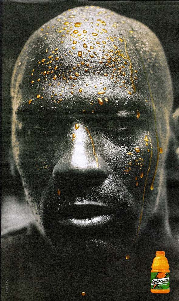
This advert from Gatorade Sport was also largely looked at as an inspiration for our 50/50 adverts. However, whilst we decided that we wanted to more colour in order to make the background more attractive. We took great inspiration from this advert because it allowed us to see how colour can change the persons perspective on what is in front of them. Whilst they have hardly advertised the drink that they are actually producing, anyone who sees this advert once, will forever recognise this as the Gatorade ad. This is because of the fact that the ad is so different and whilst being in black and white it still stands out so much due to the vibrant orange. From this advert, we identified that for our own advert using colouring to contrast the black and white, and then link to the half half idea of our video, was the most effective way we could take this idea and implant it into our own advertisement.As the the main interest in our advertisement is the can, we can help it look even more refreshing and desirable due to the way we ourselves use black and white to contrast colouring.
Video Advert:
Similarly to the Magazine and Billboard advertisements, creating a video ad comes with many codes and conventions that should be followed in order to gain the best advantage for creating a successful advert. I shall be disguising the codes and conventions that we followed below.
 |
| Image from Video Ad |
 |
| Image from Video Ad |
 |
| Image from Video Ad |
 |
| Image from the Video Ad |
 |
| Image from Video Ad |
Once the PhizzWizzard, which is emphasised by bigger red writing (which links to our colour scheme), is consumed the clear change in tone around the advert is aimed to show the viewer the "power" of the drink. Music by Bruno Mar immediately comes in instead of the old style music and everything is in colour. This not only suggests the change the drink makes to the tone, but also allows us to target our 13-18 year old target audience as everything is brought back to modern times and we are playing current up to date music. By adding this switch in our advert it gives off the idea that the drinks bring life back to the consumer, which would hopefully mean that the viewers are more inclined to try the drink for themselves.
 |
| Image from Google |
One of our main inspirations for our first half of the advert was the effect of the movies from the Charlie Chaplin era. We used the same features of, black and white screen, no sounded dialog, and subtitles to tell the viewer what is being said. This helps us give off the effect we were going for form the brief of this being a retro drink as everyone can assume that black and white movies are old and outdated. Even though, they were not used from promotional value, we deiced to use the same idea to really allows us to create a humorous effect and yet still portray the unhappy mood we were attempting to create.
 |
| Image from Video Ad |
Our video was linked further by costumes, as at the begging of the advert we decided to follow trend and made our characters dress extremely well and wear tie and blazers, like in the old times. This helps to put a further emphasis on the importance of the job and therefore increase the perceived stress levels on Mr Rodgers. With the attire of the suit we wanted to show to the views that this drink is suitable for all of all class. This is especially important as we want to attract as many customers as possible to help boost the brand name. Mr Rodgers's outfit also included an old English hat which is very important for meeting the briefs description of a retro theme. This can link to our secondary target audience of 30+, as this type of hat is still worn today but by older people.
 |
| Image from Video Ad |
 |
| Image from Downton Abby |
As well as this, the costume has a clear contrast between the retro first half theme to the second half of the video ad. The three piece with an old English flat cap suggests that the first half of the ad is retro and links to the characters stress and clear well paid job. However, after the drink has been consumed and the young Rodgers is going out to a dinner party he is simply wearing a white shirt and black trousers which can be perceived as a more modern dress style as the drink has brought the ad to the modern times with the pop music and colour theme. These two decisions for costumes will help link the two target audiences that we are trying to attract to our product.
Lastly, we looked into the convention of how we would indicate to the audience that after drinking the drink that there was a change without it just being an instant change to colour. However, we did not want to take up too much time either. Therefore, we went with the retro ripple effect, which further helps to meet the client brief. This also can be seen as a humorous effect as many comedy shows and films use this effect to indicate a funny flashback memory which helps target the audience more as many will be used to seeing this type of effect.
 |
| Image from Video Ad |
D2 (U20): Demonstrate how the technical and aesthetic properties of the media components meet the client brief.
Our client brief was set to us by the soft drink company "Carter Soft Drinks" as they are releasing a new drink and need help with creating promotional material to help bring brand awareness to the new drink "PhizzWizzard". The brief we were given included their two target audiences, of the primary demographic of 13-18 year olds and their secondary demographic of 30+ year olds. They asked us to create a retro theme to our adverts, whilst still being able to attract the younger target audience. They asked for a Video advert, a billboard advert and a magazine advert to be created and developed in their theme.
 |
| Magazine Advert |
 |
| Billboard Advert |
The main requirement of the client brief was to create the three forms of advertising for the soft drink. To meet the brief, we had create a billboard ad, magazine ad and promotional video. The client brief stated that we had to produce these specific three forms of promotional material as they believed them to be the form of advertisement for a new soft drinks campaign.
This is because these 3 forms, as well as linked social media, are the most appropriate form of advertisement in the modern age. Especially to attempt to attract two completely different two target demographics. The two print advertisements (magazine and billboard) are great ways to reach out to our secondary target demographic of 30+ year olds. Whilst the Video ad linked with social media are more appropriate to the younger generation as they are watching TV constantly and are more likely to be paying attention to a screen than reading a magazine. With the billboard being a suitable from for advertisement for both demographics as your brain processes things you see whether you realise it or not. The bright attraction means that both demographics will be likely to see the ad.
Social media is then linked heavily with all three forms as it is rapidly growing form for advertisement as it is free to post or you can pay a small fee to promote the adverts. However, due to the fact that it is still heavily younger generation based I agree with the fact that it should not be the main focus of advertising as the more traditional methods of TV adverts seem to still be the most effect method as it attracts much more attention. The TV adverts can then be passed on through the social media platforms allowing for us to grow brand awareness even quicker, however, if we had focused solely on social media then we could potentially be missing out on the secondary demographic. As well as this, the TV adverts allow us to potentially gain other Tertiary demographics who watch the ad and decide they want to try the drink. This can be exploited especially if you are to get the right TV time slot, for example during the Superbowl or a large sporting event.
The three form templates we followed consist of:
 |
| Visualisation Diagram |
 |
| Storyboard |
 |
| Visualisation Diagram |
We decided to use these three plans so that we could create the adverts whilst meeting the client brief and developing the required codes and conventions in a creative way. This made sure that our final products will have met the brief set out by Carter Soft Drinks. This also allowed us to share our ideas with Carter Soft Drinks, meaning that they could give us feedback on what they liked and what they wanted to change.
 |
| Final Magazine Look |
 |
| Final Billboard look |
One of the most important client requirement, which was stated by the brief was to make sure that our advertisement products targeted the two different demographics. Our primary demographic being 13-18 year olds and our secondary demographic being 30+ year olds. BY creating the three different forms of promotional material, it allowed us to target the two different demographic groups. It allowed us to cater for both demographics as we were able to identify which promotional materials would connect more with the target audiences, such as social media being a very young form which would be suitable for targeting our primary demographic, and the magazine being suited to targeting our secondary demographic. With the TV ad and billboard ad being suitable to target both. The reason why it is important to make sure that we create a campaign that can cater to Carter Soft Drinks needs is because they will want to increase their brand name as quickly as possible if they are going to want to create a drink and business that can challenge at the top of the business chain. They wish to attract that retro audience who have grown up with drinks such as the PhizzWizzard but they also want to attract the younger generation as if they drink it now it will create the loop that they then eventually become the 30+ demographic that Carter Soft Drinks are attempting to target.
Whilst we had the promotional form that were more targeted at each demographic, we still had the TV and Billboard Ad that are critical to the success of the drink and therefore business. This is due to the fact that both forms allow us to target both demographics. The TV ad feature both an older hard working man that was aimed to be relatable for the 30+ year old audience, whilst the switch up, which created humorous effect, allowed us to then target the 13-18 year olds. However, the switch is extremely important as it helps to remind the older demographic of what their childhood was potentially like. The more happy, cheerful positive side to life. This creates the allure that this drink really "takes you back to your youth!". As well as this, create a familiar surrounding is important for the advert as it means that all can relate to the initial idea, whether we are targeting them or not. This means that we might even receive consumers that we are not necessarily targeting.
 |
| Logo from Ad |
The brief was declared and given to us by Carter Soft Drinks, the company who are the owners of the drink, PhizzWizzard. This means that we had to make sure that we included the company's logo in all three forms of media as this will hopefully bring brand recognition with the campaign in question. As well as this, it was included in the client brief that we had to create this campaign to raise awareness of the drink and branding. We decided that by including their company logo we would be meeting the client brief set out for us.
 |
| Drinks logo from Ad |
The client brief further stated that the drinks flavour would be strawberry laces, which is a red colour. As a result of this, to allow the customer to gain an idea of this without having to know too much about the drink, we decided to use the font Fabelt as it gives of the feel of long, windy letters that could potentially be created by individual strawberry laces. As well as this we then linked it further by making the logo colour red. We believe that this meets the brief as we are creating the logo around the flavour of the drink allowing customers to know what they should expect before they have even put lips to can. As well as this, by constantly using the same logo for the drink across all three platforms of media it means that we are able to create a logo that is easily identifiable in shops and in ads.
 |
| Image from Video Ad |
 |
| Image from Video Ad |
As well as keeping the same logo throughout all three forms of media. We also made sure the the consistent theme of the colour red was included throughout all three forms. It is important that we keep the same colour scheme throughout all the advertisement forms as it helps to make the advertisements easily identifiable. For the Video Ad we did this buy colour the bath that young Rodger would end up in for the colour scenes. This is a indication of the colour of the drink and the flavour, as many people associate the colour red with the flavour of strawberry. As well as this we changed the colour and size of the "PhizzzWizzard" in the subtitles as it helps to put emphasis on the drink and hits to the viewers to colour of the drink since there has been no colour as of yet in the video ad. Further the this we included actual strawberry laces in the video ad to indicate the flavour of the drink and we made certain that the actor was clear when announcing this feature. Finally, we made sure that we used a red car at the end of the scene to keep up the consistent factor of the red colour theme.
 |
| Image from Magazine Ad |
 |
| Image from Billboard Ad |
Finally, in the client brief it stated that the advertisements should be convergent between the different platforms. This is due to the fact that, Carter Soft Drinks want to also move advertisement to social media platforms as this is great way to target the primary demographic of 13-18 year old. This is because of the fact that they are all using these platforms constantly which makes them suitable platforms for targeting the younger audience. In the client brief, it mentioned the social media platform Facebook which is why it is the first icon on the adverts. However, Instagram and Twitter are massive platform for social media which arguable target the younger generation better. The hashtag further the links the social media platforms together as it can be used across all the platforms, which creates convergency across the platforms.
As well as this, we made sure to include the website link in all of our media advertisements. This is due to the fact that it makes the viewers easier to find out more information about the drink if they need to. This is important so that the viewers can find out information if the need to so that they don't feel like anything is being kept from them. This makes the viewers feel like that can trust in the brand, which would therefore hopefully mean that they purchase the drink which would create sales and therefore increase the brands identity.
As well as this, we made sure to include the website link in all of our media advertisements. This is due to the fact that it makes the viewers easier to find out more information about the drink if they need to. This is important so that the viewers can find out information if the need to so that they don't feel like anything is being kept from them. This makes the viewers feel like that can trust in the brand, which would therefore hopefully mean that they purchase the drink which would create sales and therefore increase the brands identity.


Comments
Post a Comment